
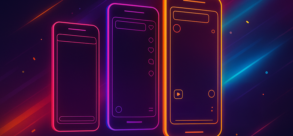
Short-form apps don’t just play your video—they crop it and draw an interface on top of it. That’s why hooks get clipped, subtitles sit under a progress bar, and CTAs hide behind a stack of buttons.
To remove the guesswork, we built pixel-accurate, all-black overlays at 2160×3840 (9×16) that recreate each platform’s on-screen UI exactly as it appears after crop. Drop a PNG on your timeline, lower the opacity (or switch to Screen blend mode), and you’re looking at a true in-app preview before you export.
These are not “safe-area boxes.” They’re content-viewport simulations—what your audience actually sees.
What’s included
- TikTok
- TikTok + Search (shows the extra search bar TikTok sometimes inserts under the video when Search Insights fires)
- Instagram Reel
- YouTube Short
- Facebook Reel
- Facebook Reel + Playlist (when a Reel lives in a playlist/series, Facebook raises the entire lower UI—this overlay reflects that lift)
All files are 2160×3840 PNGs designed to sit on top of your footage. If you edit in 1080×1920, set overlay scale to 50% so proportions stay exact.
Why author in 4K vertical
- One master, many exports. Keep a 4K project for archival/ads; export 4K and 1080 from the same timeline.
- Sharper type. Burned-in captions and titles look cleaner when composed at 4K.
- Zero math. Scale overlays to 100% for 4K, 50% for 1080. Done.
How to use the overlays
- Open a 9×16 project at 2160×3840 (or 1080×1920).
- Import the overlay PNG and place it on the top track.
- Scale the overlay (100% at 4K; 50% at 1080).
- Visibility: set Opacity 30–60%, or set Blend Mode: Screen so only the white UI appears.
- Design to what you see. Keep text, faces, and CTAs out from under the drawn UI.
- Lock the overlay while editing; disable/hide it before export.
Tip: Save two sequences—ProjectName_overlayON for layout checks and ProjectName_master for final renders.

TikTok
- Top: the search/music bar steals headline space—place your hook just below it.
- Right rail: like/comment/share stack will overlap hands/props—keep your subject slightly left of center.
- Bottom: caption + progress bar; park subtitles in the true lower-middle, not flush to the bottom edge.
TikTok + Search
- When TikTok adds a second search bar under the video, your usable lower area shrinks.
- Use this overlay for tutorials/how-tos and keyworded content that’s likely to trigger Search Insights.
- Position subtitles and CTAs above that extra bar; the template shows the exact height.
Instagram Reel
- Captions and the progress bar ride a bit higher than most people expect.
- Keep subtitles lower-middle and avoid tiny stickers on the right; the heart/comment/share column creeps in.
YouTube Short
- Title/subscribe elements compress the top; set headlines a touch lower.
- The action stack at right-middle can stomp small logos; keep branding slightly inward.
- Watch the lower-left: channel avatar + title area can nudge against long captions.
Facebook Reel
- Similar bottom behavior to IG Reels. Subtitles belong in the lower-middle area shown by the template.
- The right-side interaction column grows on engagement; don’t hug that edge with text.
Facebook Reel + Playlist
- When a Reel sits in a playlist/series, Facebook shows a playlist label that raises the entire lower UI.
- Use this overlay if you know a Reel will live in a playlist—or default to it if you’re unsure (it’s the stricter case).

Premiere Pro
- Sequence: 2160×3840 (or 1080×1920).
- Overlay on V3+, Opacity 40% or Screen blend.
- Lock the layer, then disable visibility before export.
Final Cut Pro
- Project: Vertical 9×16 at 2160×3840.
- Set overlay to Fit, adjust Opacity.
- Toggle the visibility checkbox off to render.
DaVinci Resolve
- Timeline: 2160×3840.
- Overlay on the top track; reduce opacity or set Composite Mode: Screen.
- Mute the overlay track on Deliver.
After Effects
- Comp: 2160×3840.
- Overlay at the top; precomp your footage for global adjustments.
- Solo/unsolo the overlay for QC passes.
CapCut / VN (desktop or mobile)
- Project: 9×16.
- Add overlay above your clip; set Opacity ~35–50%.
- Delete/disable the overlay clip before exporting.
(The overlays don’t change export needs—they make sure the design survives the app UI.) Confirm exact timeline size and that the overlay isn’t auto-scaled to 99%. Disable “Scale to Frame Size” type automations. Lower overlay opacity or use Screen so only the white UI lines display. You used FB Standard but the Reel ended up in a playlist. Re-layout with the Playlist overlay—the bottom moves up. Default to the TikTok +Search overlay; it’s safer. If the bar doesn’t appear, you’ll just have more breathing room. Keep overlays at 100% while editing; export a 1080 version by scaling the entire sequence—no need for different templates. They’re better for vertical 9x16 videos: instead of generic margins, you’re seeing the actual UI that sits on top of your video. Yes—they target the in-app 9×16 viewport. Device bezels differ; the content viewport and UI placement remain consistent. No—those are dynamic. Use the overlays for the baseline UI, then give yourself a little extra breathing room if your niche triggers pop-ups. Absolutely—branded color lines, thinner strokes, PSD/AEP versions, even combined multi-platform QC comps if your team wants a single pass.Design playbook
Q&A checklist
Export settings that behave
Troubleshooting
Overlay looks a pixel off.
Everything feels darker.
Crowded in Facebook after publishing.
Unsure whether TikTok will show the extra search bar.
Editing at 4K, delivering 1080.
F.A.Q.
Are these “title-safe” overlays?
Do they account for iOS vs. Android?
Do they include temporary pop-ups (comments, stickers, ads)?
Can I customize them?